
Quiet Color, Lush Texture, Effortless Calm
Color That Speaks Softly
Foundations: Building a Muted Palette
Start with three anchor hues pulled from nature: weathered stone, dried sage, and warm plaster. Test large swatches across daylight and evening warmth. Aim for harmony in undertones rather than matching. When everything whispers, texture, light, and shadow become eloquent storytellers that reward quiet attention.
Light, Undertones, and the Honest Swatch
Hold samples vertically, not flat, and walk them through the room. LED temperatures distort personality; dim to evening and ask whether green, red, or violet undertones peek through. Photograph with and without flash. Honest tests prevent surprises and empower confident restraint that feels welcoming, not severe.
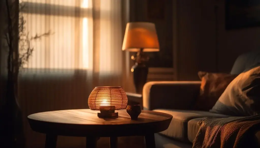
Contrast Through Value, Not Volume
Instead of loud chroma, build contrast through value and finish. Pair pale mushroom walls with charcoal textiles, then bridge with mid-tone oak. Matte, eggshell, and soft sheen create depth without glare. Your eye reads difference, your nerves read calm, and the space gains gravity without weight.
Texture That Feels Like a Handshake
Natural Fibers and Honest Weaves
Stone, Plaster, and the Poetry of Imperfection
Metal, Glass, and the Quiet Spark
Layering Without Clutter
The Rule of Three, Reimagined
Group objects and materials in trios that share an undertone but differ in scale: heavy oak bench, mid-weight linen throw, fine-grain ceramic cup. The eye triangulates, feeling completion. Rotate one element seasonally to learn how little it takes to refresh clarity without reintroducing noise.
Negative Space as a Material
Treat empty floor and wall as active partners. White space lets textures read at human speed. Place furniture off walls to create passages of light. A bare corner can frame a single branch arrangement, letting subtle greens and vessel glaze speak more clearly than an army of decorations.
Rooms That Breathe

From Moodboard to Reality
Sampling Like a Professional, Even at Home
Collect swatches in a portable box: paint cards, fabric squares, metal chips, stone offcuts. Tape them onto cardboard and live with them a week. Spill coffee, wash gently, and observe resilience. Real life is the test. Photograph in shade and sun to validate your chosen calm.
Sourcing Ethically and Beautifully
Prefer makers who publish provenance and repair paths. FSC-certified woods, recycled metals, and low-VOC finishes protect airflow and conscience. Ask vendors about replaceable parts. The most sustainable choice is durable and repairable. Share ethical sources in the comments to help others build quiet spaces with integrity.

Digital and Brand Expressions
Typography as Texture
Type behaves like material. Choose humanist serifs or warm grotesks with gentle contrast. Avoid razor-thin hairlines that shimmer on screens. Set generous leading and moderate contrast ratios. Letterspacing becomes breathing room. Your words feel touchable, and the interface inherits the same hospitable restraint found in quiet interiors.
Product Photography: Soft Light, Strong Story
Photograph products near soft north light with muted backdrops: limewash, canvas, or uncoated paper. Reduce saturation slightly and preserve texture through careful sharpening. Include a hand occasionally for scale and humanity. The result sells feeling, not noise, inviting trust and longer attention without aggressive manipulation.
Interfaces That Whisper and Delight
Design motions that feel inevitable, like curtains settling. Use easing curves, short durations, and opacity changes instead of bouncy translations. Keep backgrounds matte, highlights subtle, and interactive affordances clear. People will linger because the interface behaves with the same patience you asked of your physical space.
All Rights Reserved.